The Orchard Bar
Web development & Maintenance
HTML/CSS/React
2019 - ongoing
theorchardbar.co.uk/
github.com/12vblanco/react-orchard
Requirements
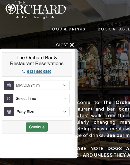
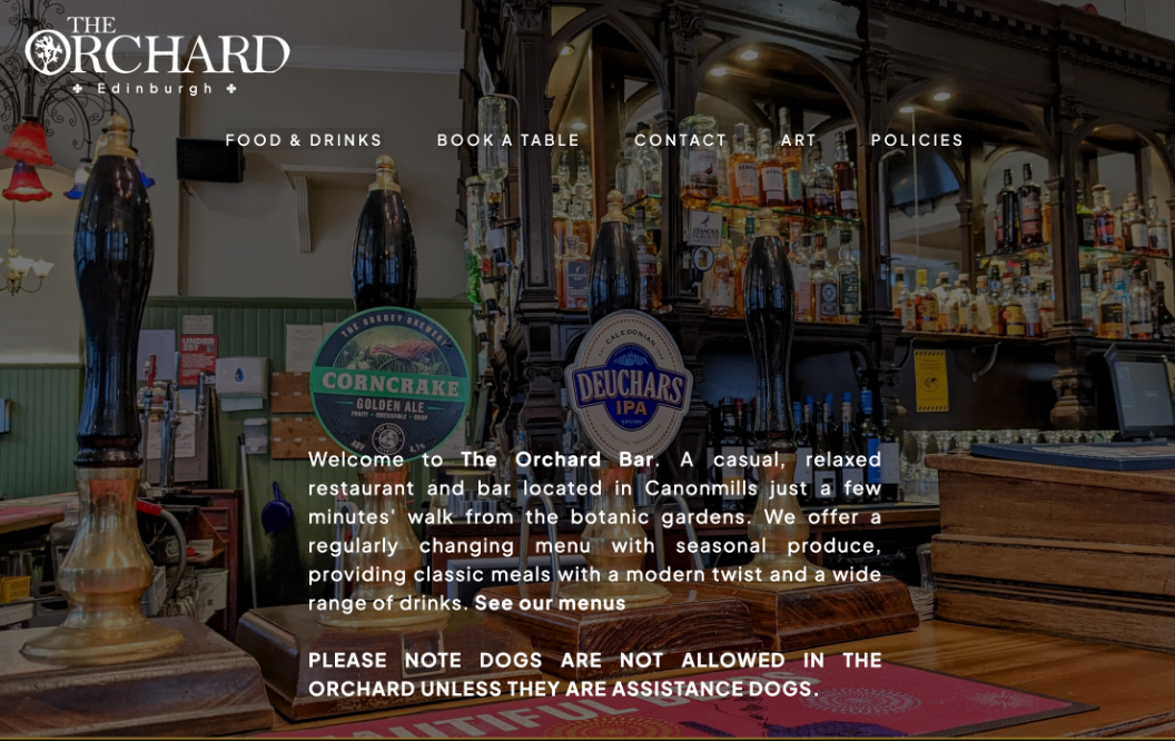
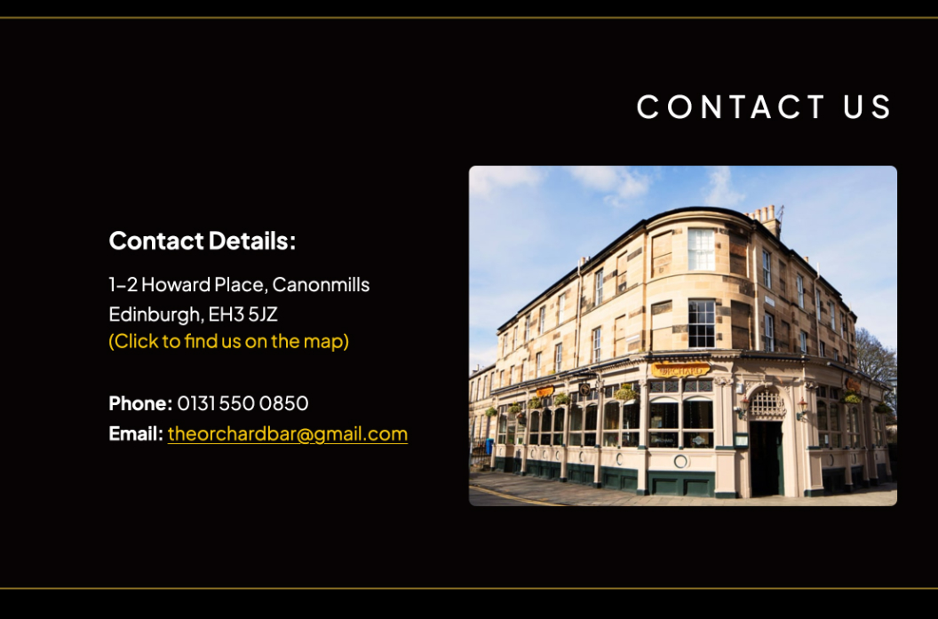
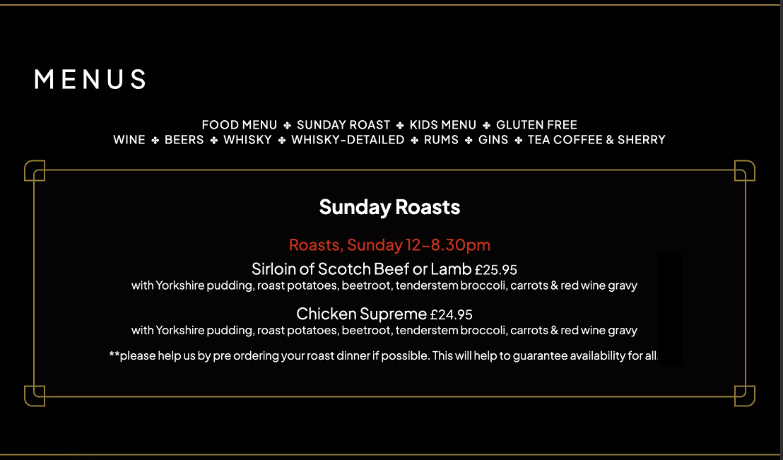
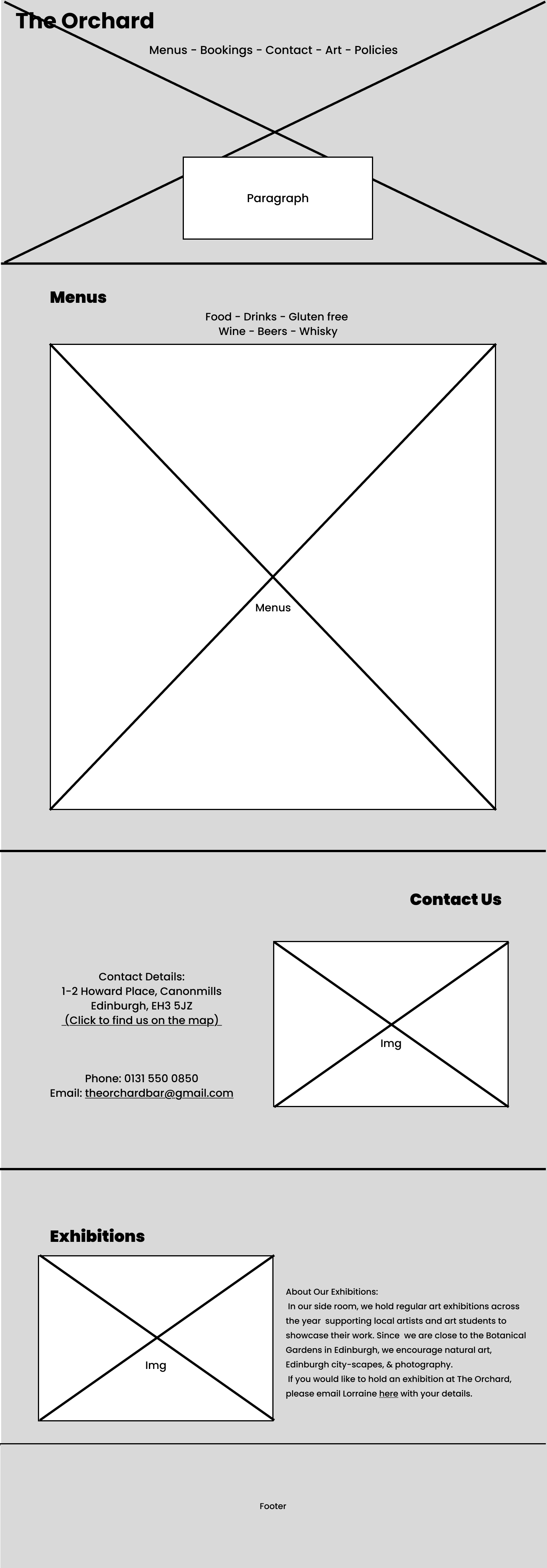
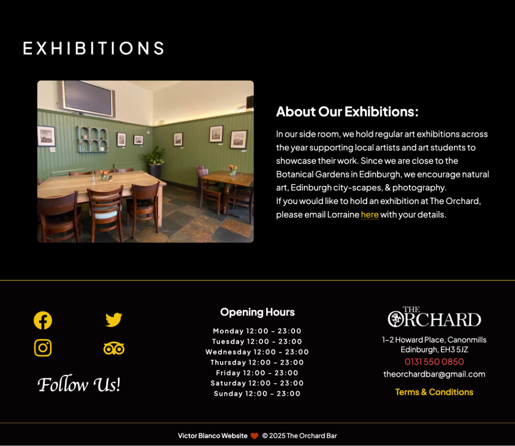
I received a straight forward request: A simple to use and accessible website that would include a gallery, a booking system and contact details. It needed to also have a page to showcase the art exhibitions and a section showing the many menus that contain food and drinks served at the Orchard's. Finally, they also requested opening times and social media links.
The Navigation bar is the same component through the whole website and holds much of the information. It has a burger menu access the art section and the gallery, together with social media links. it also con``
Typography
The Orchard's logo employs a classic, serif font, communicating style and elegance. Throughout the website, 'Open Sans', a clean and versatile font, is used for its readability across various weights and scalability. It's open-source and readily available. All fonts are embedded in the source code to ensure accessibility, even with poor internet connections.
Navigation: Open Sans 20p
H1: Open Sans 32p
H2: Open Sans 28p
P: Open Sans 19p
Nav_contact: Poppins 14p
Dancing Script
The blueprints were designed during the planning stages to gather feedback from The Orchard's owners, which was then integrated back into the design process. Once the general aesthetics and requirements were agreed upon, the construction of the website commenced.
Design Choices
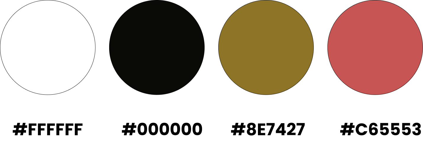
The logic behind the design choices was to mirror the ambiance and atmosphere of The Orchard Bar. Black was chosen for its strong neutrality and contrast, transmitting elegance and formality, paired with white for text and gold emulating the whisky bottles throughout the bar. The owners are delighted with the outcome, and I continue to assist in content updates for as long as they want me to.
This project has been ongoing for 7 years, making The Orchard my longest-standing client.